Down Home Ranch
Brand Guide
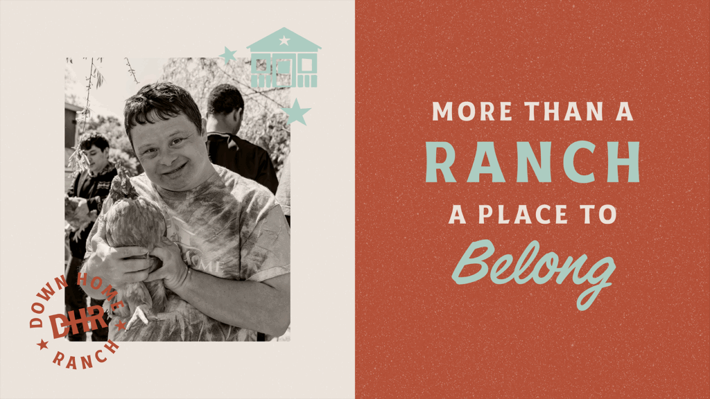
More than a ranch. A place to belong.
Down Home Ranch is a working ranch in Central Texas where people of all intellectual and developmental abilities live with purpose, work with pride, and belong without exception.
We are the
Everyman
Traits
Friendly
Honest
Helpful
Practical
Makes consumers feel
Understood
Included
Warm
“I am part of the group.”
We Are
Warm, Not Wistful
We speak from the heart — not from a pedestal. Our voice is welcoming, but never sentimental or overly emotional. We’re proud of the joy and connection here, but we don’t romanticize or dramatize it.
Say This
“Everyone’s got a role at the Ranch — and a place at the table.”
Not
“Our Ranchers are angels among us, each with a story that will touch your soul.”
Simple, Not Sanitized
We don’t use flowery language or corporate speak. We keep it straightforward and honest — just like life on the Ranch.
Say This
"We grow tomatoes, raise chickens, and build friendships that last.”
Not
"We foster inclusive agricultural experiences through transformative service programming.”
Equal, Not Hierarchical
We avoid language that separates “us” from “them.” We’re a community — everyone’s in it together. No heroes, no recipients. Just people.
Say This
“Here, we live and work together. Ranchers, staff, and volunteers — side by side.”
Not
“We provide care and support for those with special needs.”
Helpful, Not Preachy
We offer information in a friendly, “neighborly” tone — never condescending or overly inspirational. We trust people’s good intentions and speak to them as equals.
Say This
“Not sure where to start? Come for a tour — we’ll show you around.”
Not
"It only takes one act of kindness to change a life forever.”
Proud, Not Polished
We’re not slick or overly curated. We’re proud of the dirt under our nails. Photos can be a little imperfect. Stories can be casual. That authenticity is what builds trust.
Say This
"It was a hot one, but we got the whole greenhouse cleaned out — and celebrated with watermelon."
Not
"Our horticultural team completed a successful seasonal turnover in the primary cultivation zone."
Who We Are
Guardians of a family, not a facility - grounded in purpose, driven by community, and rooted in the belief that everyone deserves a place to belong.
Our Values
Belong Without Exception
Everyone deserves to be seen, heard, and included — no exceptions. Whether you're a Rancher or a team member, you’re valued for who you are. Our relationships are built on respect, not roles.
Lead Side by Side
We don’t lead from the front — we lead from beside. Whether it's mucking stalls, solving problems, or sharing a meal, we show up as equals and pitch in as partners.
Pitch In With Purpose
We believe everyone has something to contribute. Whether you're planting, planning, or lending a hand, your effort makes this place stronger — and more meaningful.
Serve with Heart
We show up with humility and help where we’re needed. Service here isn’t about charity — it’s about showing care in small, everyday ways.
The core of our brand
Our Logo Suite

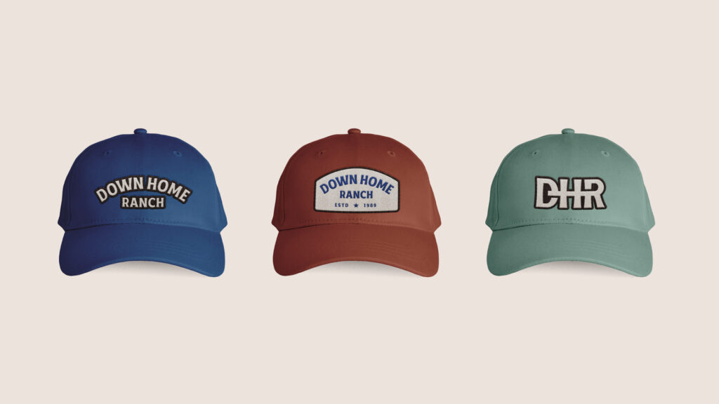
Primary Logo
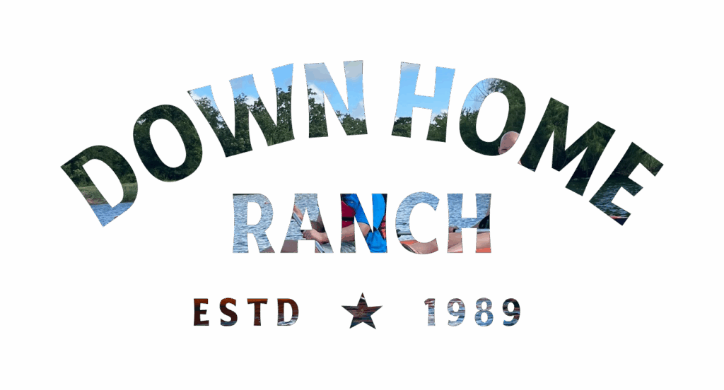
Our Primary Logo represents our down home ranch through its no-fuss, western-inspired, sans serif type and simple arrangement punctuated by the location and Texas lone star. The primary lock-up contains our logo mark and location indication.
The full primary logo lock-up should be on all official collateral when space allows. Set it primarily in our primary brand colors (blue, brown, and cream), but you may use secondary colorways in key graphics. Only set it in the following approved colorways – do not use more than one color in the logo at a time. The Black and White colorways are only to be used on brand partnership collateral when required by brand partners. DHR brand colorways are to be used on all DHR branded items.
Primary Logo Blue

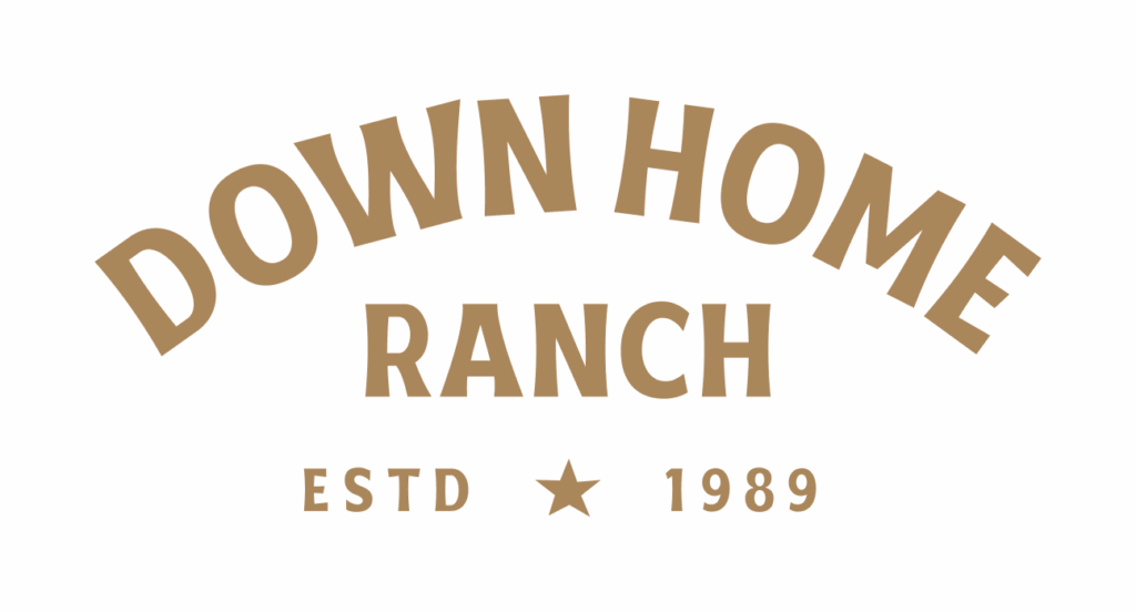
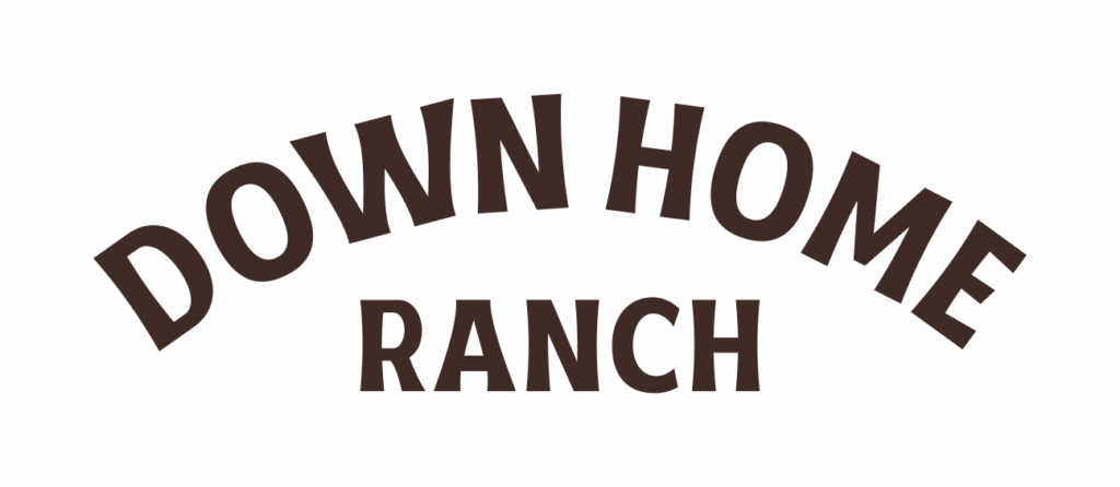
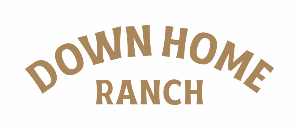
Primary Logo Brown
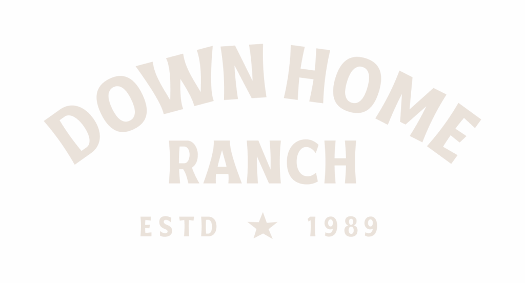
Primary Logo Cream

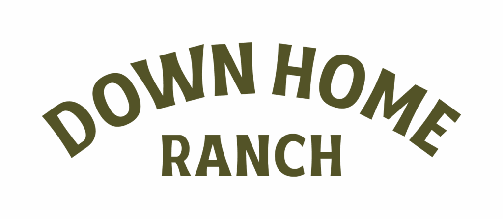
Primary Logo Green
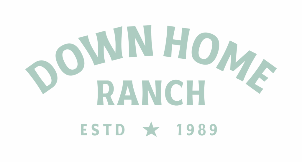
Primary Logo Mint

Primary Logo Red
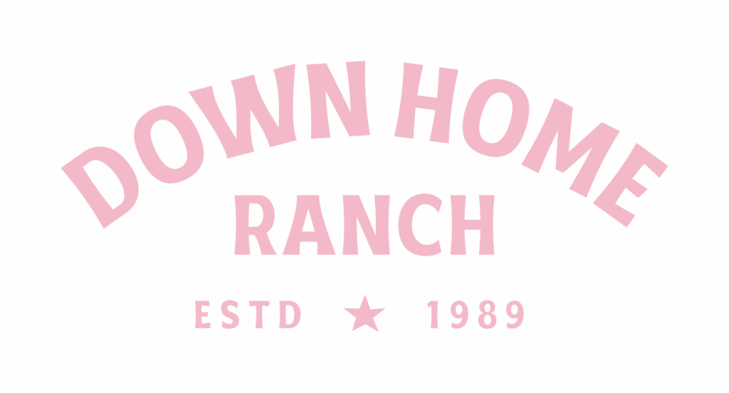
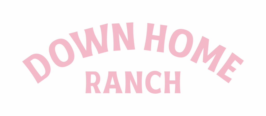
Primary Logo Pink
Primary Logo Dust
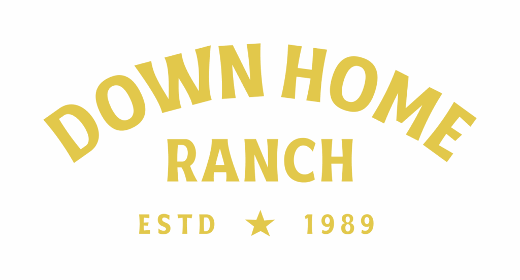
Primary Logo Yellow

Primary Logo White

Primary Logo Black
Pieces
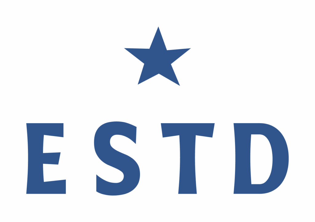
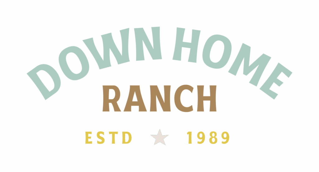
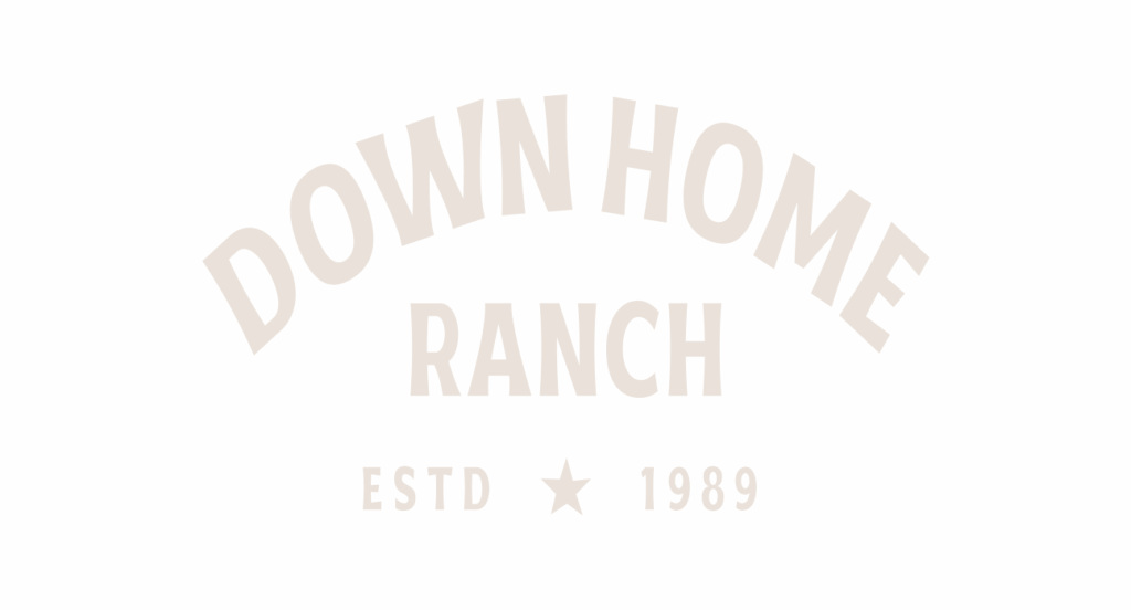
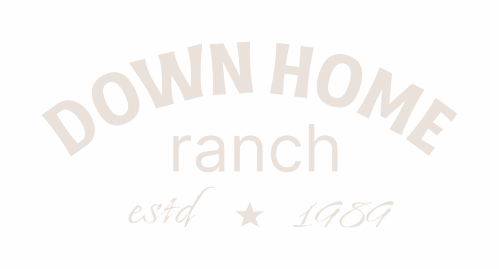
Our Pieces consist of the broken down parts of the Primary Logo.
They are to be used when the space does not allow for the Primary Logo to be present. Only use the ESTD and 1989 Pieces when the Word Mark is also present in the composition. Only set it in the following approved colorways.

Word Mark Blue
Word Mark Brown

Word Mark Cream
Word Mark Green

Word Mark Mint

Word Mark Red
Word Mark Pink
Word Mark Dust

Word Mark Yellow
ESTD Blue

ESTD Brown
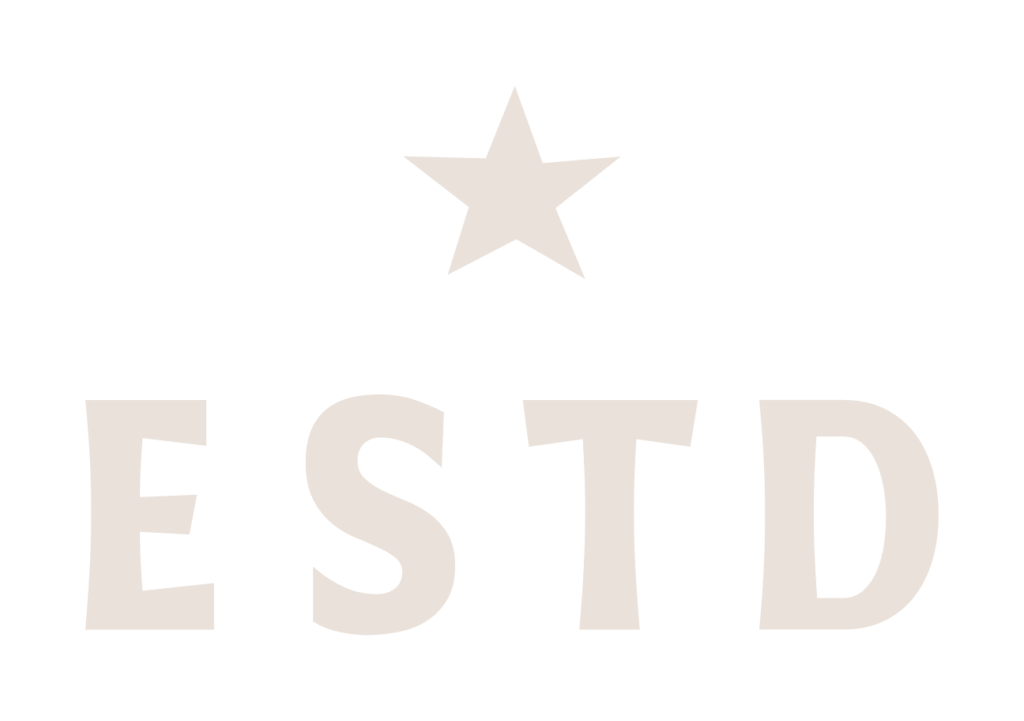
ESTD Cream
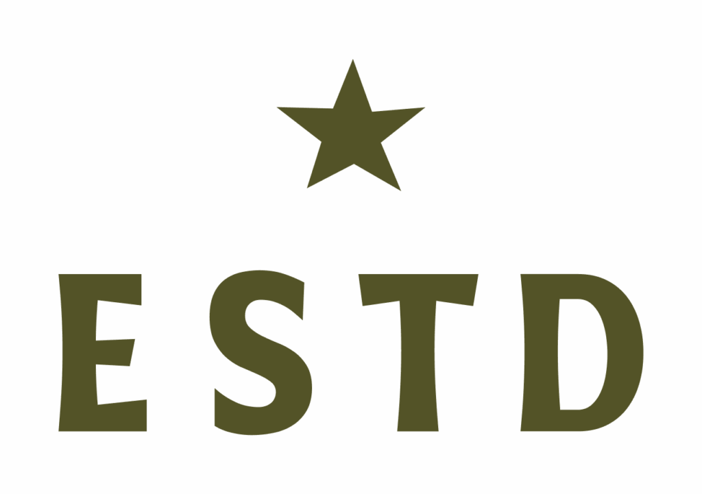
ESTD Green
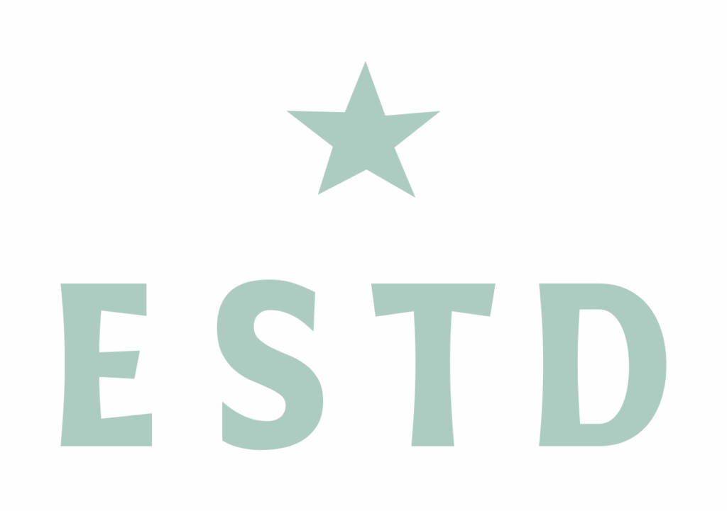
ESTD Mint
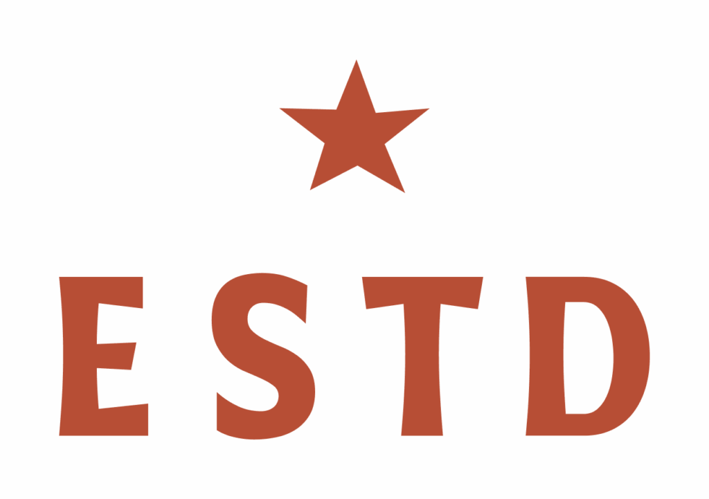
ESTD Red
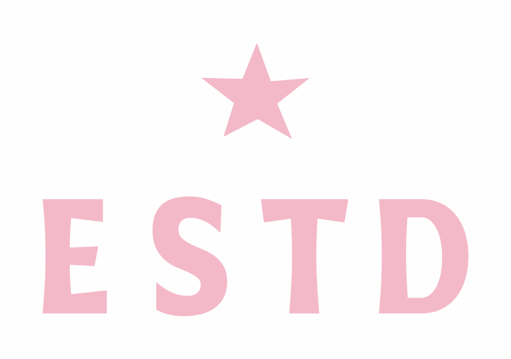
ESTD Pink
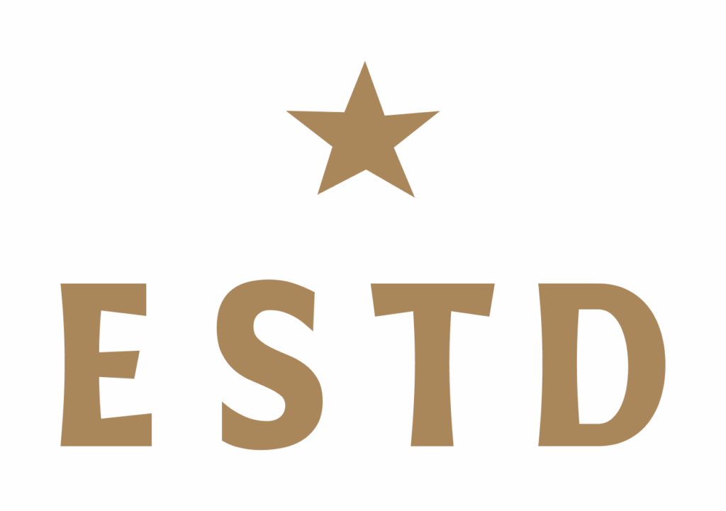
ESTD Dust
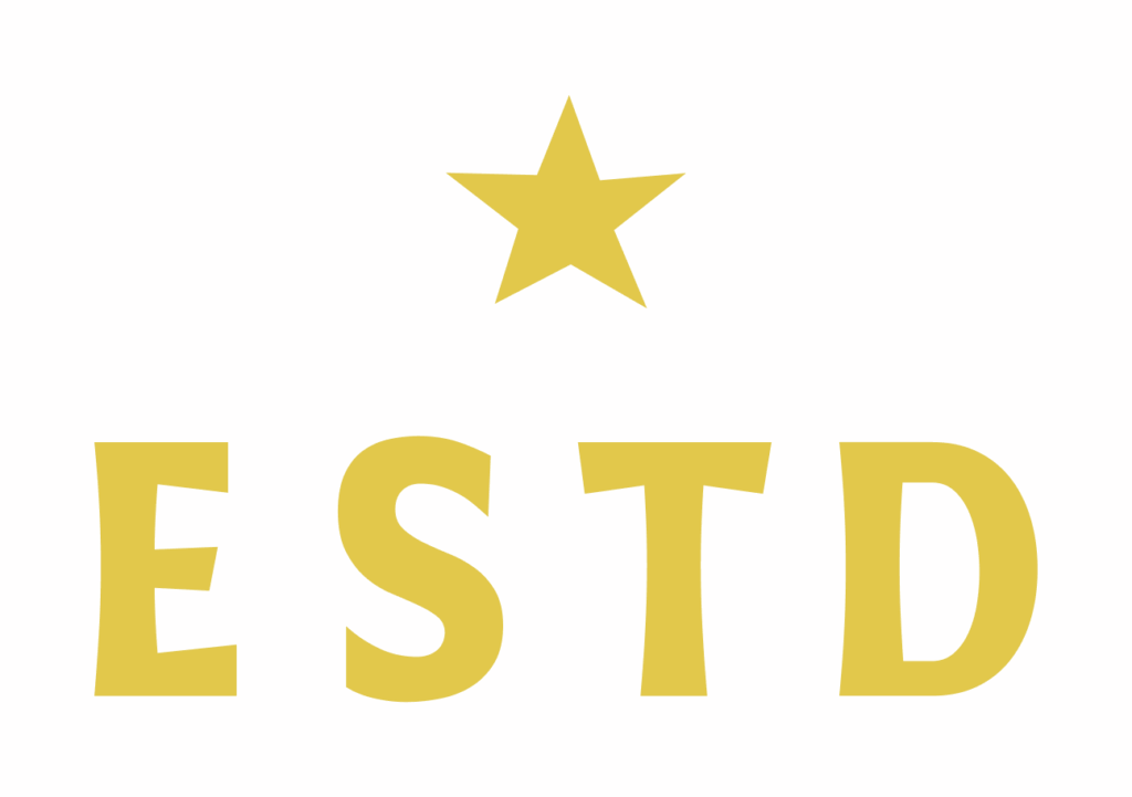
ESTD Yellow
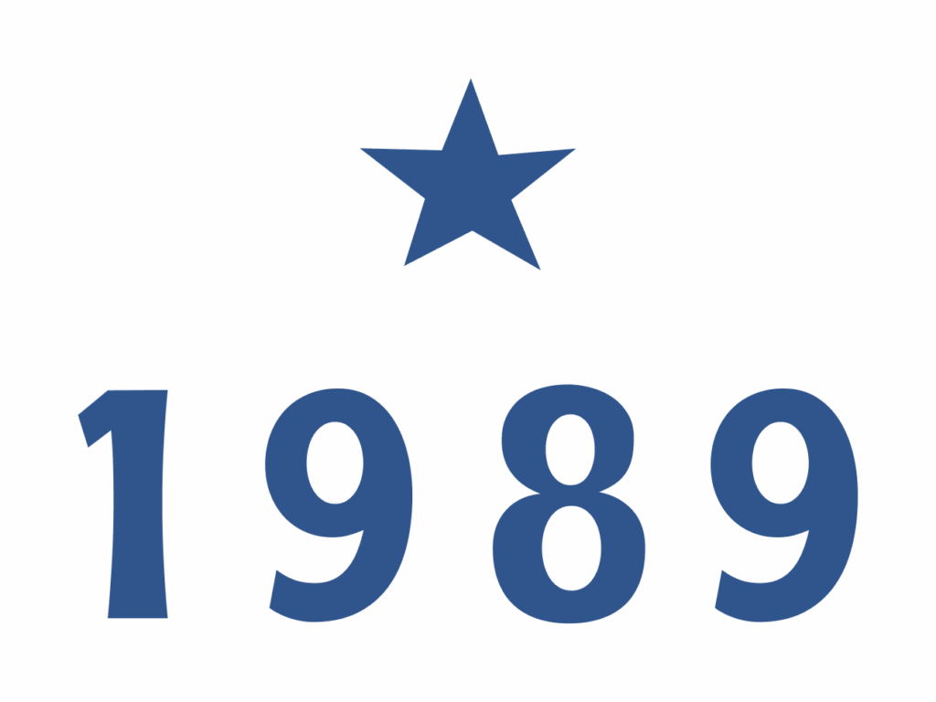
1989 Blue
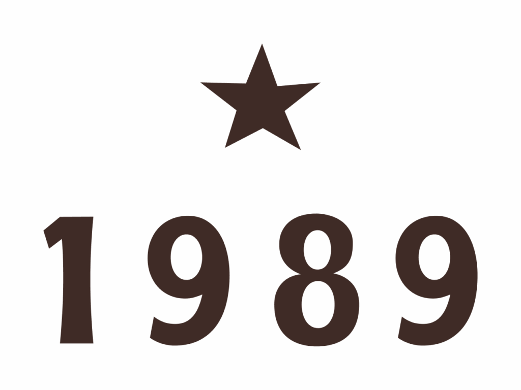
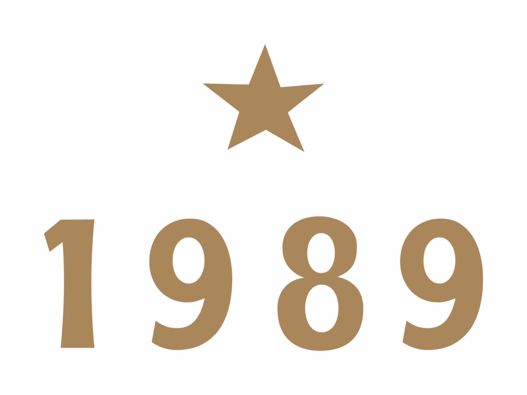
1989 Brown
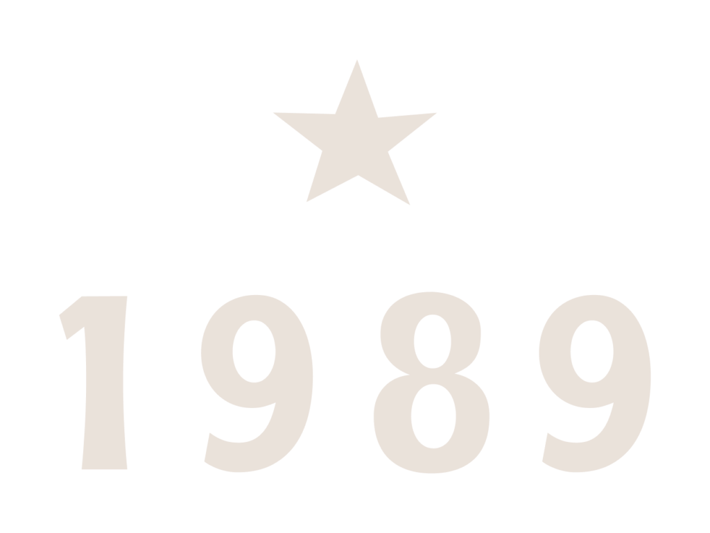
1989 Cream
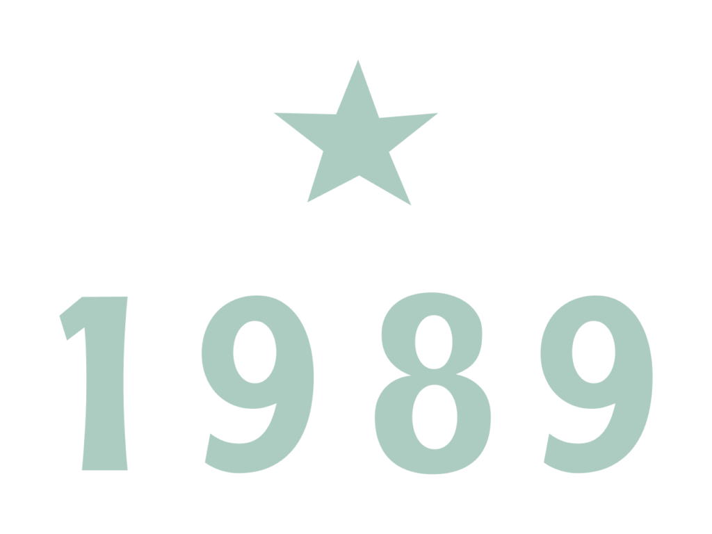
1989 Mint

1989 Red
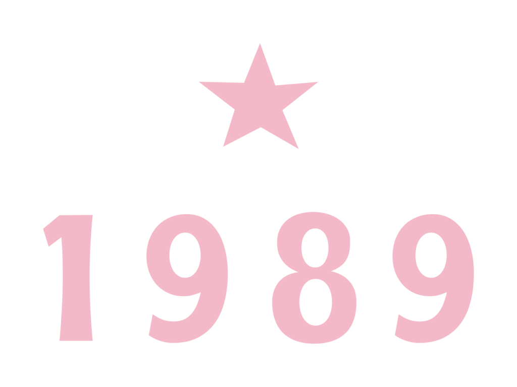
1989 Pink
1989 Dust
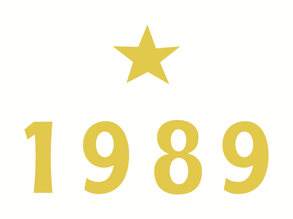
1989 Yellow

Monogram
Our Monogram is the main symbol of the brand inspired by a cattle brand. The cross bar connecting the letters represents the connection across the ranch and its people.
Utilize this mark when space doesn't allow for either the Primary Logo or the Word Mark. It may be used on applications such as social media posts and merchandise. Set it in the following approved colorways.
Monogram Blue

Monogram Brown

Monogram Cream

Monogram Green

Monogram Mint

Monogram Red

Monogram Pink

Monogram Dust

Monogram Yellow
Badge
Our Badge is an alternative logo design that may be used in place of the Primary Mark on select key graphics and merchandise. Only set it in the following approved colorways.
Badge Blue
Badge Brown
Badge Cream
Badge Green
Badge Mint
Badge Red
Badge Pink
Badge Dust
Badge Yellow
Sub-Brand Marks
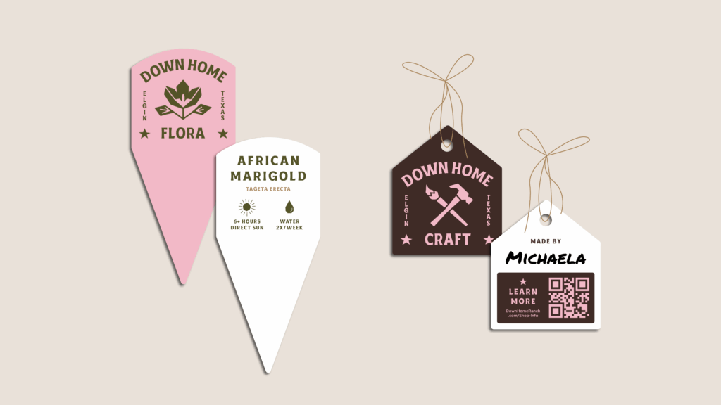
Our Sub-Brand Marks utilize our Word Mark and custom iconography to represent the key pillars of Down Home Ranch.
They are to be used in pillar-specific instances either as a whole mark or with the key icon on its own (found in the brand elements section). Whether you use the icon on its own or the whole mark, when referencing the pillar be sure to use its assigned colorway to maintain brand recognition. Use in key graphics on social and other collateral.
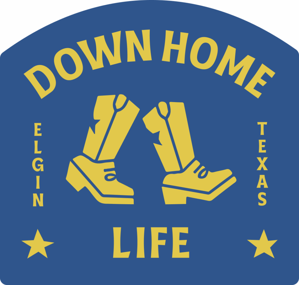
Sub-Brand Life

Sub-Brand Flora
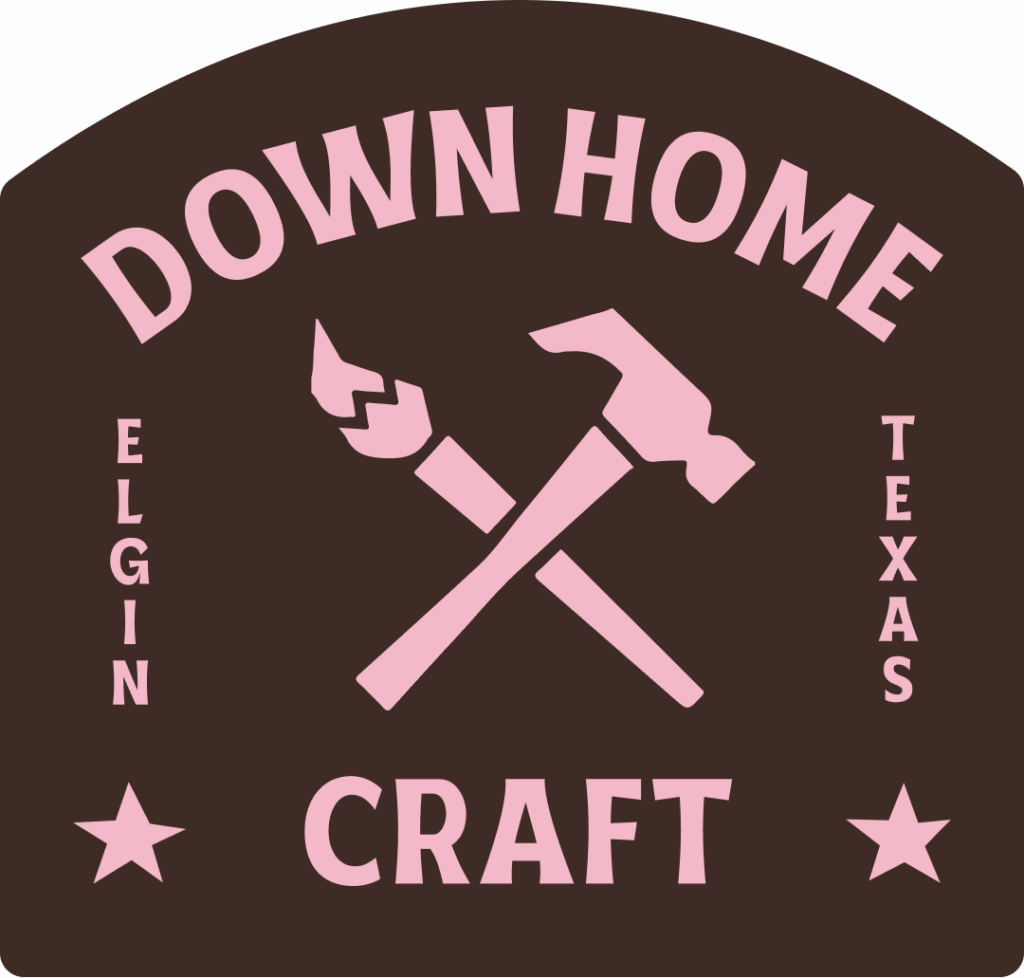
Sub-Brand Craft
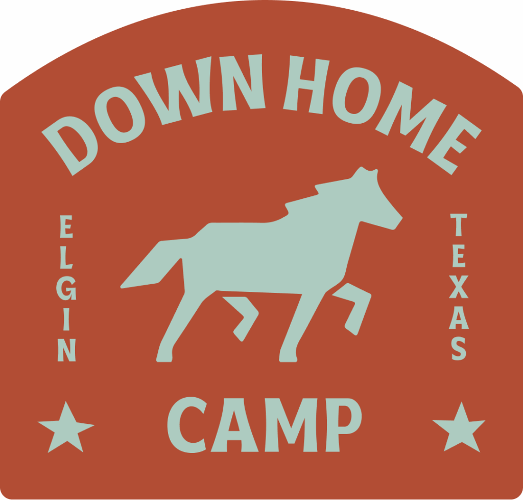
Sub-Brand Camp
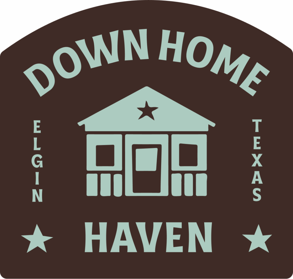
Sub-Brand Haven
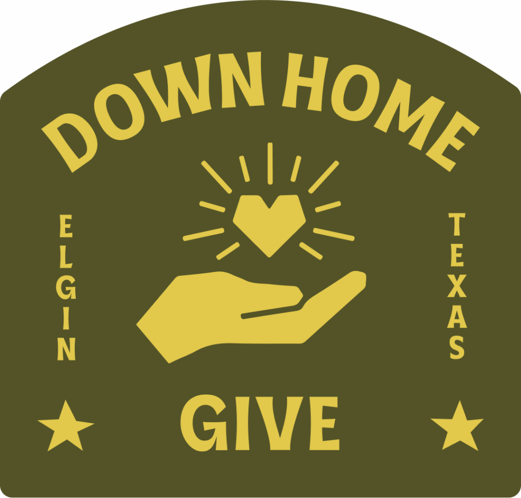
Sub-Brand Give
our logo
Usage
Safe Space
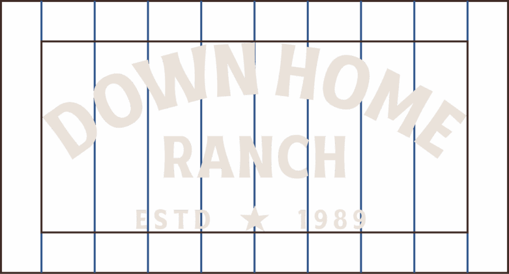
When displaying any of the logo variations, maintain ample space around it to avoid crowding or interference from other elements. To achieve this, don’t place anything within the “safe space” equivalent to 10% the width of the logo.
*Of course, there are exceptions: subtle patterns or textures overlapping at 20% opacity or less are acceptable.
Please Don't
Use unapproved color combinations or colors
Distort the logo and elements
Mask images into the logo

Place on backgrounds that make elements hard to read
Use alt fonts
Down Home Ranch in
Color
Primary Colors
Lone Star Blue
- Hex #2F558C
- RGB 47, 85, 140
- CMYK 91, 72, 19, 4
- Pantone 7683 C
Boots Down Brown
- Hex #3F2B26
- RGB 63, 43, 38
- CMYK 55, 69, 69, 64
- Pantone 2322 C
Egg Shell Cream
- Hex #EAE2DA
- RGB 234, 226, 218
- CMYK 7, 9, 12, 0
- Pantone 4246 C @ 55%
Secondary Colors
Our Secondary Colors are used to signify our sub-brands and to add color to key graphics. Limit color usage to either Brown or Cream and two other brand colors for each application.
Grounded Green
- Hex #535327
- RGB 83, 83, 39
- CMYK 59, 49, 95, 40
- Pantone 5753 C
Minty Meadow
- Hex #ADCCC1
- RGB 173, 204, 193
- CMYK 33, 8, 25, 0
- Pantone 566 C
Rancher Red
- Hex #B74E35
- RGB 183, 78, 53
- CMYK 21, 81, 88, 10
- Pantone 173 C
Passionate Pink
- Hex #F3B9C8
- RGB 243, 185, 200
- CMYK 2, 33, 7, 0
- Pantone 2036 C
Dusty Dreams
- Hex #AA865B
- RGB 170, 134, 91
- CMYK 31, 44, 71, 7
- Pantone 465 C
Over Yonder Yellow
- Hex #E2C84B
- RGB 226, 200, 75
- CMYK 13, 17, 84, 0
- Pantone 106 C
typography
Our Font Families
Eyebrow/Subheadings - basted clubs bold +100 Tracking
Aa Bb Cc Dd Ee Ff Gg Hh Ii Jj Kk Ll Mm Nn Oo Pp Qq Rr Ss Tt Uu Vv Ww Xx Yy Zz1234567890!@#$%^&
Headings - basted clubs bold +100 Tracking
Aa Bb Cc Dd Ee Ff Gg Hh Ii Jj Kk Ll Mm Nn Oo Pp Qq Rr Ss Tt Uu Vv Ww Xx Yy Zz
1234567890!@#$%^&
Accent - Filmotype lucky regular
Aa Bb Cc Dd Ee Ff Gg Hh Ii Jj Kk Ll Mm Nn Oo Pp Qq Rr Ss Tt Uu Vv Ww Xx Yy Zz
1234567890!@#$%^&
Body - Gotham Book
Aa Bb Cc Dd Ee Ff Gg Hh Ii Jj Kk Ll Mm Nn Oo Pp
Qq Rr Ss Tt Uu Vv Ww Xx Yy Zz 1234567890!@#$%^&
Body Emphasis - Gotham Bold
Aa Bb Cc Dd Ee Ff Gg Hh Ii Jj Kk Ll Mm Nn Oo Pp
Qq Rr Ss Tt Uu Vv Ww Xx Yy Zz 1234567890!@#$%^&
depth through
Design Elements
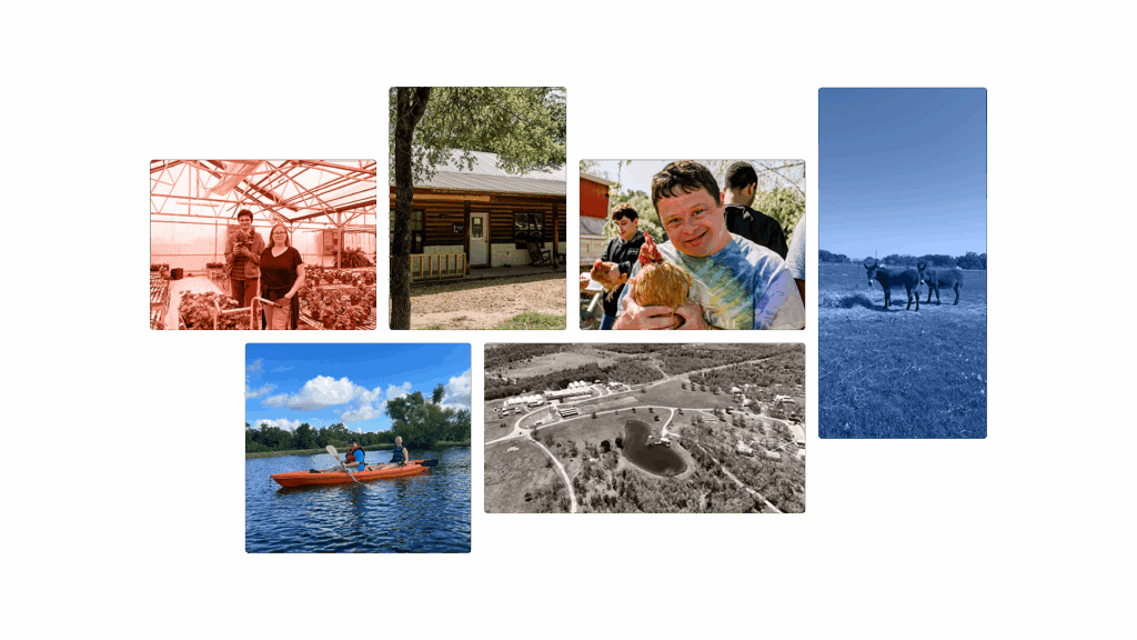
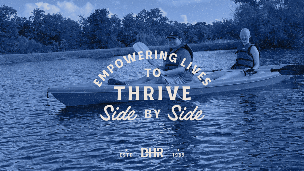
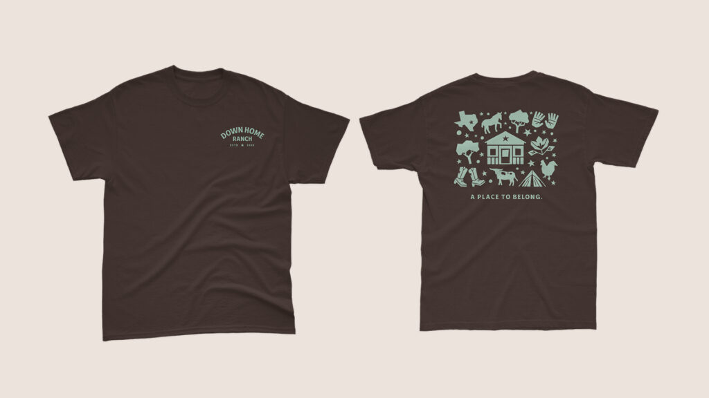
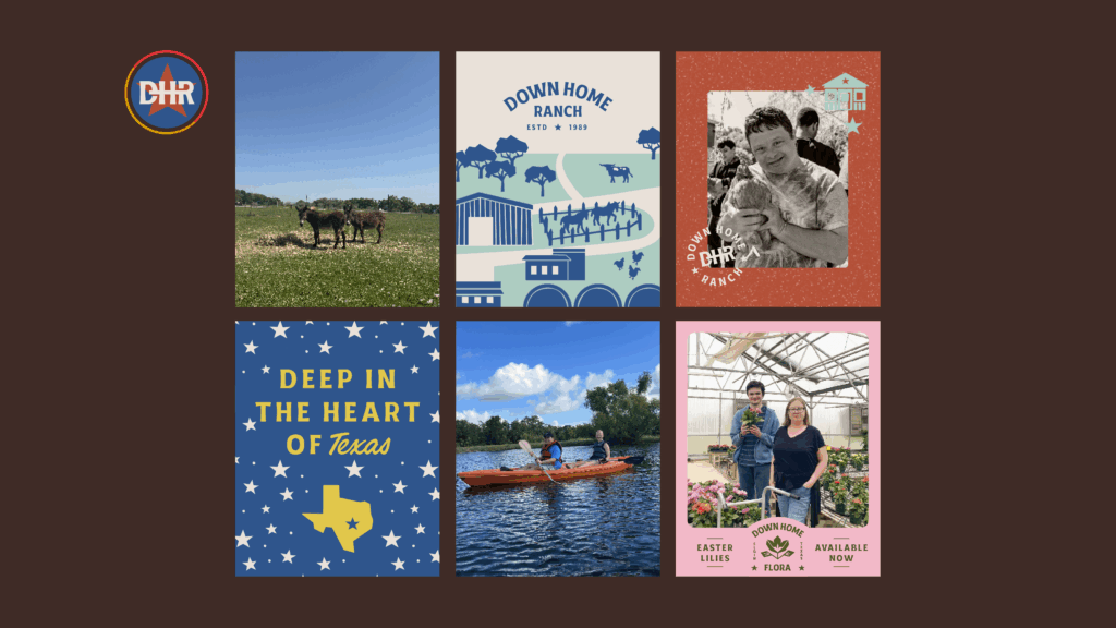
Photo Styling
Our Photography is to feature our diverse residents, visitors, and team members spanning age, race, and gender. The photography should also span locations showcasing our offerings.
Mix and match raw photos with images with a brand color filter over the top to add depth to the brand. When displaying images in a holding shape, round the corners for a consistent soft, on-brand look and feel.
Icons
Our icons represent our Sub-Brands and other aspects of Down Home life. Use in approved colorways to add texture to key graphics.
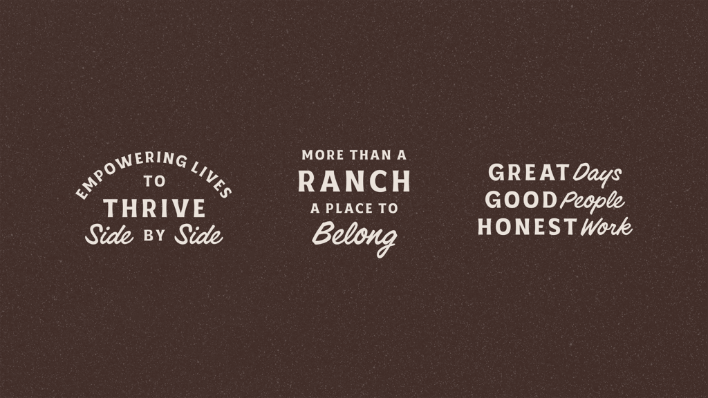
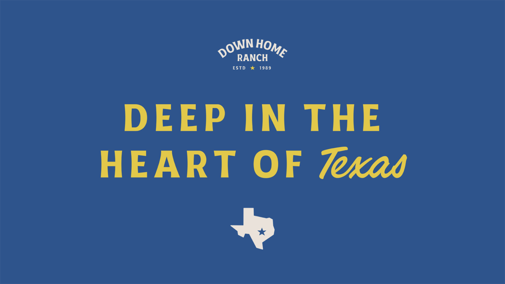
Tagline Lock-ups
Our Tagline Lock-ups utilize our brand fonts for ready-to-go lines to add to key graphics. You may use in provided colorways, or edit the vector files to mix and match colors. Limit colors to 4 per lockup.
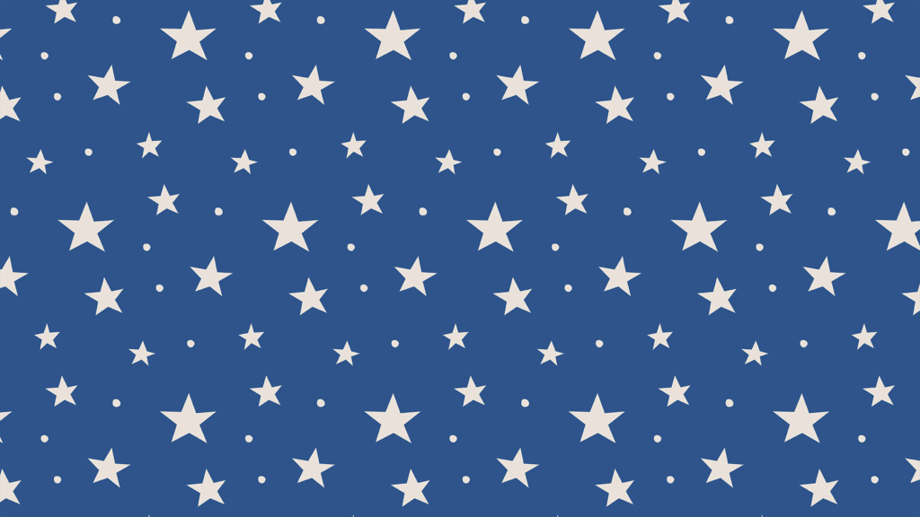
Star Pattern
Our Star Pattern utilizes hand drawn stars that tie in with our Primary Logo lone star.
Set it in the provided approved colorways (all stars in one color). Ensure text is legible through the use of holding shapes. Use in the background of key graphics to add texture.
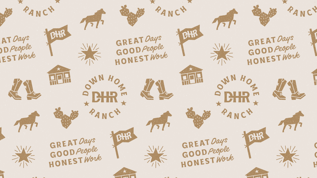
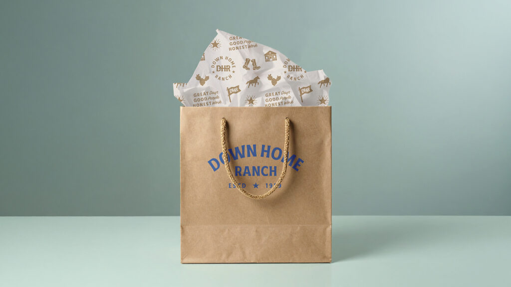
Ranch Pattern
Our Ranch Pattern utilizes a mix of our Badge mark, Tagline Lock-up, and icons to create a dynamic texture for use in key graphics.
Set it in the provided approved colorways (entire pattern in one color), and overlay grain texture to add an extra layer of depth when desired. Ensure overlayed text is legible through the use of holding shapes.
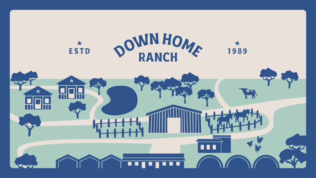
Illustration
Our Illustration uses the same wood-block style illustrations as our iconography. It represents key parts of our ranch while maintaining the fun and irregular look of our brand.
Have fun with it! One of the only graphics in which multiple colors add depth rather than distraction. Re-orient to add to key graphics, and customize as needed.

Grain Texture
Our Grain Texture adds that extra umph to key graphics when needed. Overlay on a low level of opacity when things are looking a little flat.
Brand in action
Application